Revamped Search prompt UI, clearer Data Source results
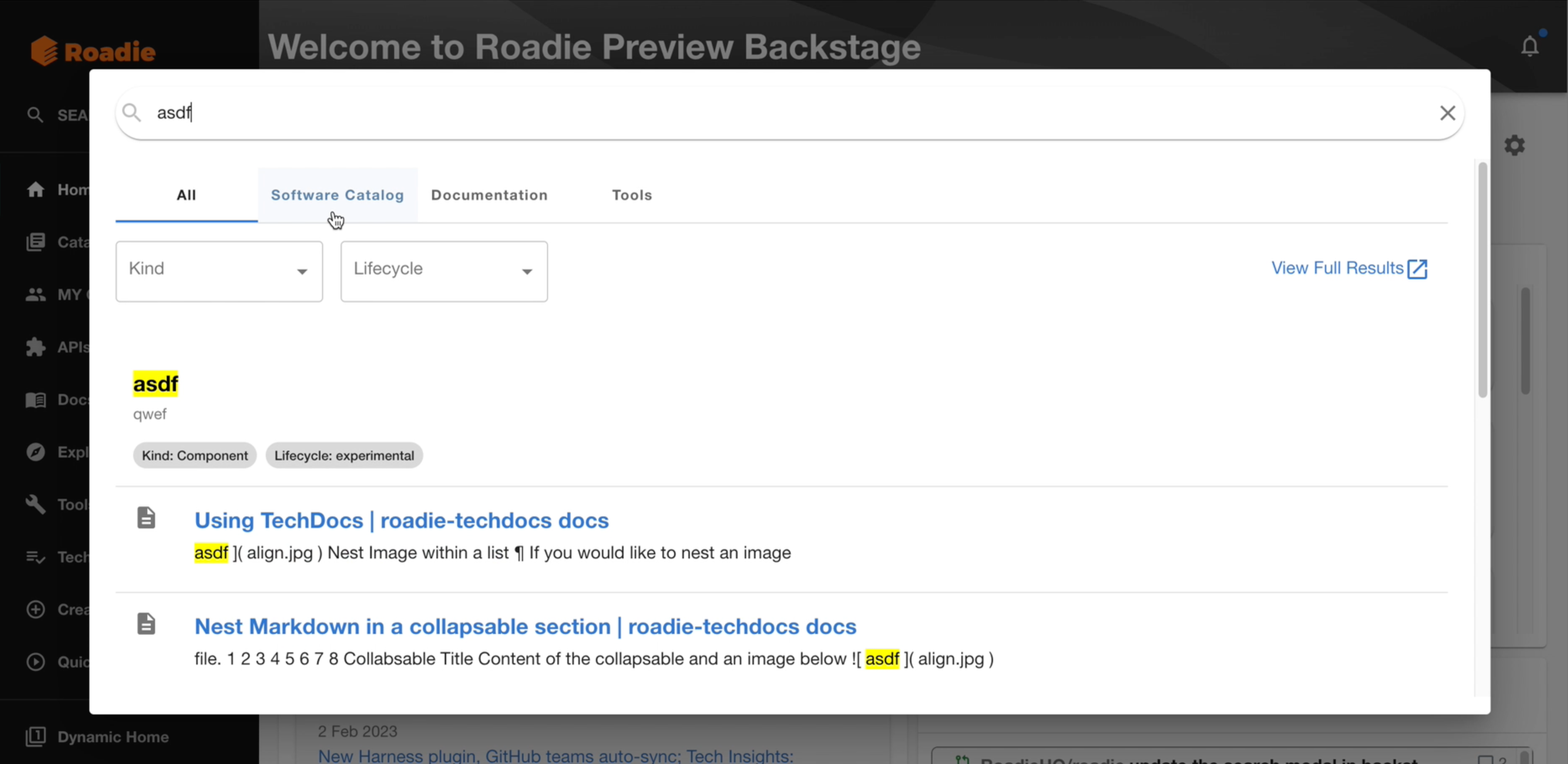
The Search prompt is featuring a new UI that lets you know the kind of results shown and filter by kind on a first glance. On Tech Insights, we’ve shipped improvements to make Data Sources results easier to track.
Search prompt with kinds
Formerly, the search prompt provided confusing results because it didn’t tell you what kind of element you were looking at. We have now shipped a new prompt UI that shows you the kind of each result and lets you filter results by type.

Try out the new UI today by searching for something and let us know what you think!
Tech Insights: Clearer Data Source results
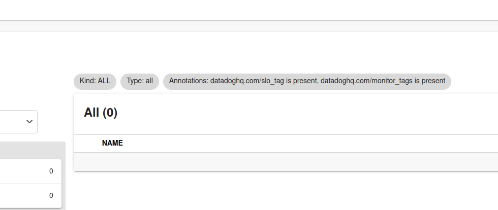
When you looked at the Data Source results page, it sometimes showed different numbers from the same entity filter compared to the Catalog page, which would be confusing. This was caused due to the lack of clarity of which filters were applied on each page. We have updated all the data sources and the UI to communicate more precisely which results the user is looking at in every instance:
